Personalizing How Charts Are Formatted
Introduction
You can personalize the formatting properties of the following areas
on a chart:
chart size, background,
and border – choose a color and a border line size
data – show or hide the
data values and format the font size, style, and color
legend – format the legend
text and define a background and border style
chart axes – format the
values and labels, and define the axis scale and marker frequency
• number format – select
a number format for numbers, currency, time, or dates
Formatting chart size, background, and border
When you create a new chart, you can modify the default chart size,
and also format the chart background and border. The
following section of this guide tells you how to:
Changing the chart size
To change the chart size:
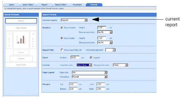
Make sure you are in Edit
mode and verify you are on the Format tab.
If the Format tab is not visible, check the More report options check
box.
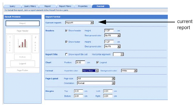
A document can contain multiple reports. The name of the selected report
appears in the Current report dropdown list box.
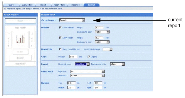
Leave the displayed report
selected.
Or
Select a different report by clicking the arrow next to the Current
report dropdown list box, and then select a different report from the
list.
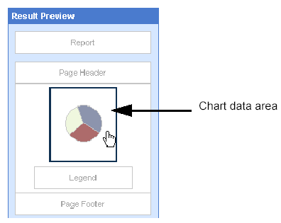
On the Result Preview pane,
select the data area of the chart.
The Chart Format options for chart data, appear to the right of the
Result Preview pane.
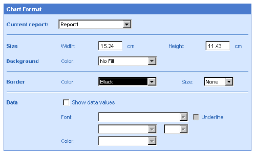
In the size section, type
the measurement value(s) you want for the chart width and chart height
into the Width and Height text boxes.
The measurement unit used for the position (for example, inches or
centimeters) is specified in your locale.
Click Run, if you are generating
the results for the first time.
Or
Click Apply, if you have already generated the results once.
Formatting the chart background and border
To format the chart background and border:
Make sure you are in Edit
mode and verify you are on the Format tab.
If the Format tab is not visible, check the More report options check
box.
A document can contain multiple reports. The name of the selected report
appears in the Current report dropdown list box.
Leave the displayed report
selected.
Or
Select a different report by clicking the arrow next to the Current
report dropdown list box, and then select a different report from the
list.
On the Result Preview pane,
select the data area of the chart.
The Chart Format options for chart data, appear to the right of the
Result Preview pane.
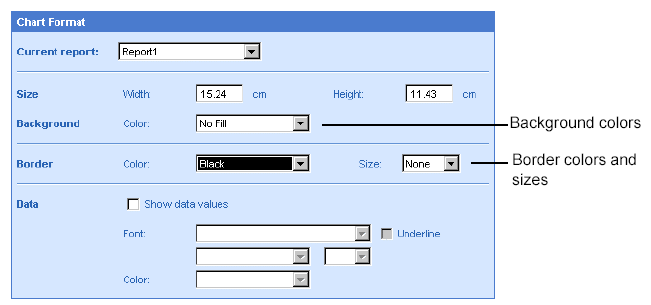
In the Background section
of the options, click the arrow next to the Color list box, then select
a color from the dropdown list or select No Fill to remove a background
color from the chart.
In the Border section of
the options, click the arrow next to the Color list box, then select a
color from the dropdown list.
And
Click the arrow next to the Size list box, then select a border size
from the dropdown list or select None to remove a border from the chart.
Click Run, if you are generating
the results for the first time.
Or
Click Apply, if you have already generated the results once.
Formatting the data in charts
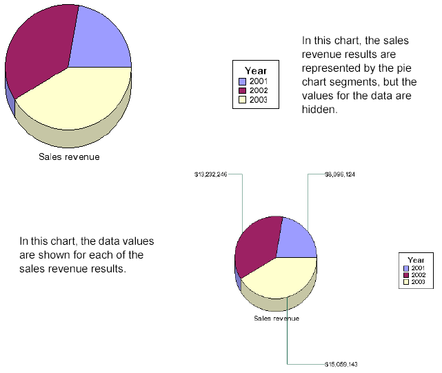
The data in charts is displayed in the bars, lines, segments, or markers
on the chart body. By default, WebIntelligence displays the data on the
chart graphically, but hides the values. You can opt to show the values
on the chart body and then define how the values are formatted.
Showing the data values is particularly useful for pie charts because,
unlike bar, line, and scatter charts, pie charts have no axis scale. The
following illustration shows two versions of the same 3D pie chart. The
first version has the data values hidden. The second version has the data
values shown.
On pie charts, you can also show the data values as percentages.
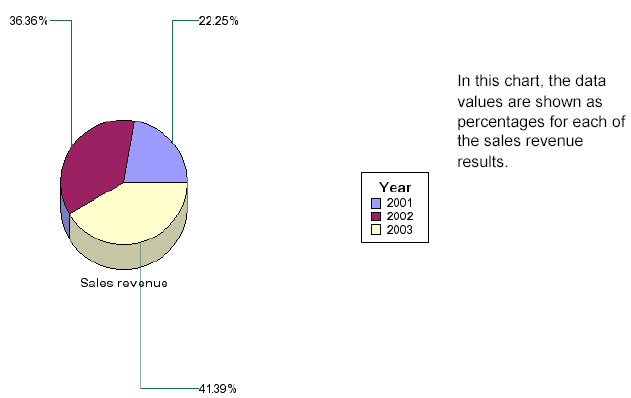
This option is not available for other chart types.
Showing and formatting data values
To show and format data values:
Make sure you are in Edit
mode and verify you are on the Format tab.
If the Format tab is not visible, check the More report options check
box.
A document can contain multiple reports. The name of the selected report
appears in the Current report dropdown list box.
Leave the displayed report
selected.
Or
Select a different report by clicking the arrow next to the Current
report dropdown list box, and then select a different report from the
list.
On the Result Preview pane,
select the data area of the chart.
The Chart Format options for chart data, appear to the right of the
Result Preview pane.
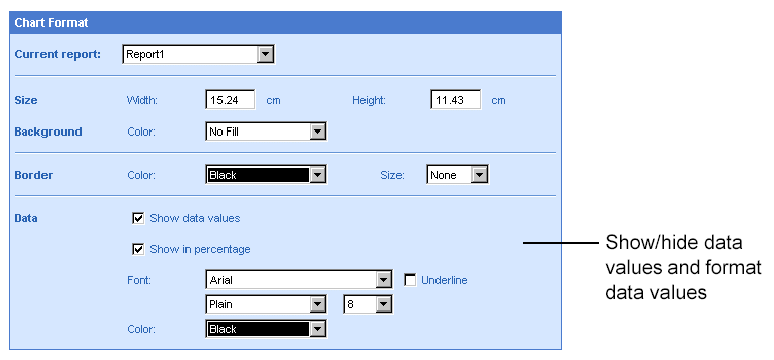
If chart is a pie chart, the option Show in percentage appears. This
option to display chart values as percentages is not available for other
chart types.
To show the data values
on the chart, select Show data values.
Or
To hide the data values on the chart, unselect Show data values.
If the selected chart is
a pie chart and you want to display the data values as percentages, select
Show in percentage.
Click the arrows on the
list boxes next to Font to select the font style, size, and color from
the dropdown lists, and either select or unselect the Underline check
box as appropriate.
Click the arrow on the
list box next to Color to select a color for the values.
You can apply other modifications to the document using the tabs on
the HTML Report Panel or run the report now to view the results.
Click Run, if you are generating
the results for the first time.
Or
Click Apply, if you have already generated the results once.
Formatting the legend
You can format the text, background, and border on chart legends.
Formatting a chart legend
To format a chart legend:
Make sure you are in Edit
mode with the HTML Report Panel open and verify you are on the Format
tab.
If the Format tab is not visible, check the More report options check
box.
A document can contain multiple reports. The name of the selected report
appears in the Current report dropdown list box.
Leave the displayed report
selected.
Or
Select a different report by clicking the arrow next to the Current
report dropdown list box, and then select a different report from the
list.
On the Result Preview pane,
click the Legend area of the chart.
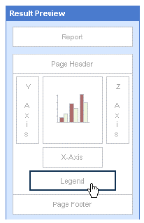
The Legend Format options appear to the right of the Result Preview
pane.
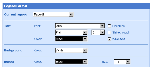
In the Text section, format
the text font style, size, color, by clicking the arrows next to the Font
and Color list boxes and selecting the formats from the dropdown lists.
To wrap, underline, or
strikethrough text select the appropriate check boxes.
In the Background section
of the options, click the arrow next to the Color list box, then select
a color from the dropdown list or select White to remove a background
color from the legend.
In the Border section of
the options, click the arrow next to the Color list box, then select a
color from the dropdown list.
And
Click the arrow next to the Size list box, then select a border size
from the dropdown list or select None to remove a border from the legend.
Click Run, if you are generating
the results for the first time.
Or
Click Apply, if you have already generated the results once.
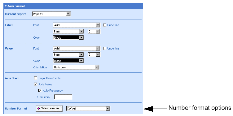
Formatting chart axes
You can personalize the following formatting properties for chart axes:
axis values
axis labels
axis scale
Formatting axis values
To format axis values:
Make sure you are in Edit
mode and verify you are on the Format tab.
If the Format tab is not visible, check the More report options check
box.
A document can contain multiple reports. The name of the selected report
appears in the Current report dropdown list box.
Leave the displayed report
selected.
Or
Select a different report by clicking the arrow next to the Current
report dropdown list box, and then select a different report from the
list.
On the Result Preview pane,
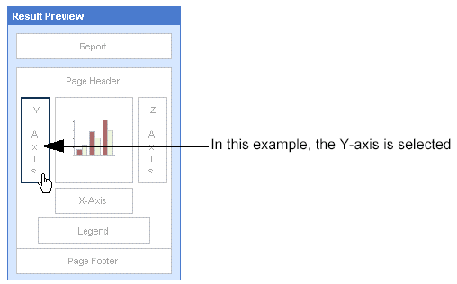
click the Y-axis, X-axis, or Z-axis area of the chart.
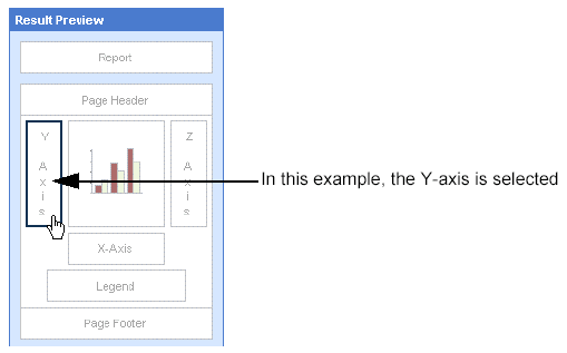
The Axis Format options for the selected axis appear to the right of
the Result Preview pane.
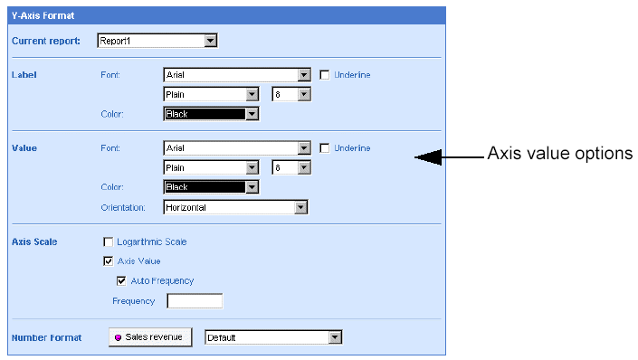
In the Value section, format
the text font style, size, color, by clicking the arrows next to the Font
and Color list boxes and selecting the formats from the dropdown lists.
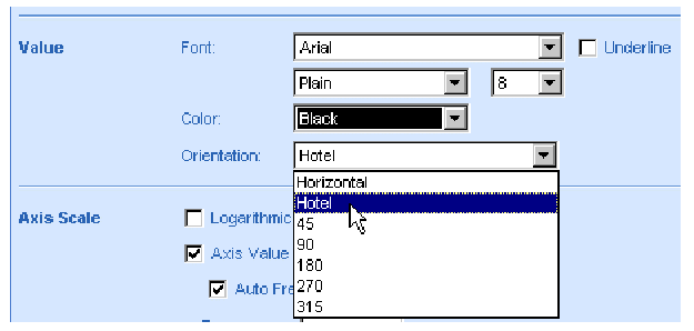
If you want to format X-axis
and Z-axis values to display at an angle, click the arrow next to the
Orientation list box and select the orientation from the list.
Click Run, if you are generating
the results for the first time.
Or
Click Apply, if you have already generated the results once.
Formatting axis labels
To format axis labels:
Make sure you are in Edit
mode and verify you are on the Format tab.
If the Format tab is not visible, check the More report options check
box.
A document can contain multiple reports. The name of the selected report
appears in the Current report dropdown list box.
Leave the displayed report
selected.
Or
Select a different report by clicking the arrow next to the Current
report dropdown list box, and then select a different report from the
list.
On the Result Preview pane,
click the Y-axis, X-axis, or Z-axis area of the chart.
The Axis Format options for the selected axis appear to the right of
the Result Preview pane.
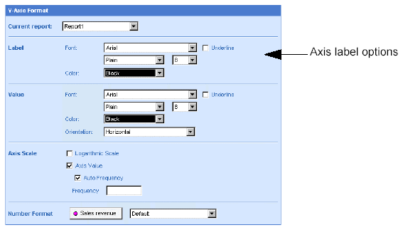
In the Label section, format
the text font style, size, color, by clicking the arrows next to the Font
and Color list boxes and selecting the formats from the dropdown lists.
Click Run, if you are generating
the results for the first time.
Or
Click Apply, if you have already generated the results once.
Formatting an axis scale
To format an axis scale:
Make sure you are in Edit
mode and verify you are on the Format tab.
If the Format tab is not visible, check the More report options check
box.
A document can contain multiple reports. The name of the selected report
appears in the Current report dropdown list box.

Leave the displayed report
selected.
Or
Select a different report by clicking the arrow next to the Current
report dropdown list box, and then select a different report from the
list.
On the Result Preview pane,
click the Y-axis, X-axis, or Z-axis area of the chart.
The Axis Format options for the selected axis appear to the right of
the Result Preview pane.
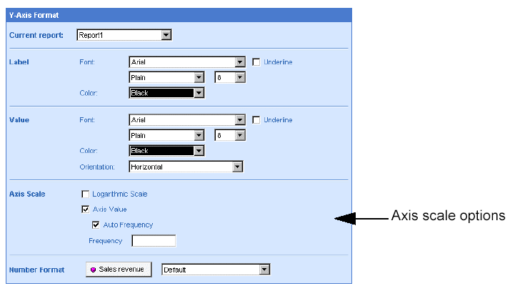
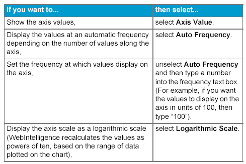
Select the appropriate
options.
The following table will help you select the options you need:
Click Run, if you are generating
the results for the first time.
Or
Click Apply, if you have already generated the results once.
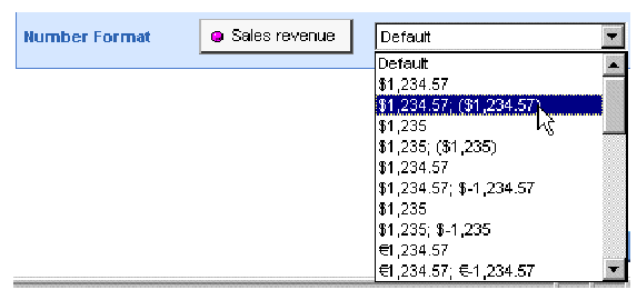
Selecting a number format for axis values
You can specify how numbers, currencies, dates, and times are formatted
on chart axes. This is referred to globally as selecting a number format.
Selecting a number format
To select a number format:
Make sure you are in Edit
mode and verify you are on the Format tab.
If the Format tab is not visible, check the More report options check
box.
A document can contain multiple reports. The name of the selected report
appears in the Current report dropdown list box.
Leave the displayed report
selected.
Or
Select a different report by clicking the arrow next to the Current
report dropdown list box, and then select a different report from the
list.
On the Result Preview pane,
click the Y-axis, X-axis, or Z-axis area .
The Axis Format options for the selected axis appear to the right of
the Result Preview pane.
Click the arrow next to
the Number format list box, and then select the appropriate format from
the dropdown list.
Click Run, if you are generating
the results for the first time.
Or
Click Apply, if you have already generated the results once.